Table of Contents
- Key Takeaways
- Introduction
- How California Funds Student Need
- Recent Policy Changes Complicate Student Need Measures
- FRPM Diverges from Other Indicators of Poverty and Income
- FRPM Tracks Student Disadvantage, but Broader Measures Match More Closely
- Simulating Alternative Funding Mechanisms
- Conclusions and Recommendations
- Notes and References
- Authors and Acknowledgments
- PPIC Board of Directors
- Copyright
Key Takeaways
With pandemic stimulus funding subsiding, efforts to boost achievement, stem absenteeism, and narrow outcome gaps in California’s TK–12 public school system will rely on the level and sustainability of ongoing state and local dollars. First implemented over 10 years ago, California’s Local Control Funding Formula (LCFF) provides additional funding for high-need students. Participation in the federal program for free and reduced-price school meals (FRPM) is a primary determinant of high-need status—and therefore school funding. However, recent policy changes and a growing mismatch between FRPM and other socioeconomic indicators complicate the formula’s ability to target student need effectively and equitably.
In this report, we take a closer look at the impact of policy changes in recent years—including the introduction of universal school meals—and examine trends and challenges in the identification of low-income students based on FRPM eligibility. We then assess how alternative measures of need would compare under California’s school funding formula. Several key themes emerge:
- The shift to universal school meals may have temporarily reduced FRPM counts during the pandemic. We find decreases in counts for districts with higher shares of students that were not automatically certified for FRPM, while counts remained stable and even grew in districts where nearly all students were. Effects were largest in 2021 and have since mostly recovered. They are not explained by changes in poverty, incomes, or other socioeconomic variables. →
- The gap between FRPM and other poverty measures is growing over time. Poverty rates have decreased in the last decade while FRPM enrollment has grown slightly. FRPM income eligibility tops out at 185 percent of the poverty line—$57,720 per year for a family of four. Yet the share of FRPM students more closely aligns with the share of public-school children in families with incomes up to 300 percent or $93,600 per year—and in recent years—close to 400 percent or $124,800 for a family of four. →
- Districts with similar FRPM enrollment rates—and thus funding—can have dramatic differences in underlying economic conditions, demographics, and student outcomes. FRPM does not always capture or reflect nuances in districts’ socioeconomic characteristics. Differences between FRPM and comparable Census-based income estimates can be partially explained by differences in the share of lower- to middle-income students just above the FRPM-eligibility cutoff. →
- Other measures do a better job than FRPM of targeting student disadvantage. Consistent with prior research, FRPM remains a strong predictor of student test scores. But this is less true for non-test score outcomes like graduation, A–G completion, and absenteeism; broader socioeconomic measures are more highly associated with need across all dimensions. →
- The equity implications of LCFF formula changes depend on how concentrated poverty is funded. Alternative mechanisms that do not account for concentrations of student need could redirect funding from lower- to middle-income districts. Our findings suggest targeting improves with formulas that provide additional funding for students who fall into multiple categories of disadvantage—such as English Learners (ELs)—and formulas that define low-income status automatically via participation in other social services like food assistance. →
At its core, the school meals program is a nutritional program. Yet, because of its role as the key indicator for need in LCFF, it is a fundamental determinant of funding levels in most districts. We find differences between the share of students identified as low-income based on the meals program and alternative estimates using other measures of poverty, income, and socioeconomic status. Recent adoption of universal school meals and changing incentives around FRPM identification could further weaken the connection between these indicators. Given this growing disconnect—and the greater connection between other socioeconomic measures and student outcomes—state policymakers should consider alternative ways of identifying need for funding schools.
Introduction
Serving nearly 6 million students from Transitional Kindergarten (TK) through high school, California’s public school system spends over $130 billion in state, local, and federal money. Yet despite these near-record-high funding levels, challenges facing TK–12 education abound. Expirations of one-time federal funds to assist in pandemic recovery mean districts now face difficult choices about which stimulus-funded services and resources to continue offering students and staff. Emerging state budget deficits threaten to constrain funding growth and cloud the future revenue outlook. And declining enrollment across the state reflects broader demographic factors like falling birthrates and stagnant population growth that will force difficult downsizing decisions in most districts over the coming decade (Lafortune and Prunty 2023).
Most fundamental, however, are the challenges facing students. Attendance lags far below pre-pandemic levels, and while chronic absenteeism has retreated from post pandemic highs, roughly 25 percent of students were chronically absent in 2022–23. Rates are higher for younger students (36% in kindergarten, inclusive of TK), among socioeconomically disadvantaged students (31%), and among some racial/ethnic groups (37% among Black and Pacific Islander students) (Hill and Prunty 2024). Proficiency rates on the state standards tests of English language arts and math remain below those seen before the pandemic. Graduation rates are persistently high—even rising slightly during the pandemic due to loosened criteria—but negative trends in college readiness are concerning. Furthermore, gaps in student outcomes remain significant by race and socioeconomic status (SES). Despite some progress over the decade prior to the pandemic—in part due to additional funding directed to high-need districts (Lafortune, Herrera, and Gao 2023; Johnson 2023)—gaps slightly widened after it, with uneven learning loss and recovery.
Without federal stimulus funding, efforts to boost achievement, stem absenteeism, and narrow outcome gaps will rely on the level and sustainability of state and local dollars marshaled to fund them. Most of this funding—$80 billion, or roughly $15,000 per student—is allocated through the state’s Local Control Funding Formula (LCFF). First implemented in 2013–2014, California’s relatively recently reformed school finance system combines general purpose base grants with additional funding for high-need students—who are low-income, English Learners (EL), and/or foster youth.
These targeted students are primarily identified by their low-income status, which is proxied by eligibility for subsidized meals in the federal school meals program—often referred to as free or reduced-price meals (FRPM). FRPM shares in California schools have risen over the past several decades, going from around 45 percent in the early 1990s to above 60 percent in 2023–24 (Figure 1). These rates increased most substantially following the Great Recession from 2008 to 2012, with only a modest rise since. Rates also fell notably during the pandemic but have since recovered and surpassed 2019–20 levels.
FRPM rates in California public TK–12 schools have increased substantially in recent decades
Share enrolled in FRPM (%)

SOURCES: California Department of Education; Authors’ calculations.
NOTES: Year shown is based on fall (i.e., 2022=2022–23). Includes Transitional Kindergarten (TK) students from 2012 onwards.
However, although access to subsidized meals is means tested, this program is designed to address student nutrition and is not a fundamental measurement of poverty or student need. The indicator is also binary—students are considered low-income whether they are in deep poverty or just below the eligibility threshold. Moreover, there is a wide range of income variation in households above the FRPM eligibility line. Focusing only on whether students meet a given income threshold may miss important differences elsewhere in the income distribution. Does using FRPM shares in funding decisions effectively and equitably direct funding to address student needs?
Findings from the broader research literature both motivate and corroborate concerns over the FRPM measure. Studies in other states and nationally have identified a growing disconnect between FRPM eligibility and more direct poverty measures (Domina et al. 2018; Michelmore and Dynarski 2017; Fazlul, Koedel, and Parsons 2023).
Furthermore, California recently introduced universal school meals, allocating state funding to districts to provide meals for all students regardless of income. Districts have raised concerns that the shift has made collecting income forms harder and could depress counts of FRPM-eligible students. This could have negative implications for LCFF funding levels (Fuller et al. 2023) as well as several other programs—like the equity multiplier and Expanded Learning Opportunities Program—that target funds to low-income students.
In this report we examine recent trends in student FRPM rates and study the impacts of recent policy changes on these rates, including the introduction of LCFF and the shift toward universal school meals that started with pandemic waivers and has since been established as a permanent program. We then compare FRPM levels and trends to other common measures of poverty and income. Next, we consider how well FRPM proxies for disadvantage along different student outcomes, comparing it to other measures. Finally, we simulate alternatives to measuring high-need status as we currently do under LCFF, examining the distributional impacts of potential policy changes. We conclude with policy recommendations based on our findings.
How California Funds Student Need
A fundamental concern to most school finance systems is how to target high-need students with additional funding. Key decisions include whether to fund different aspects of student need (and which ones), how to measure these needs, and how much additional funding to provide. Past research on LCFF shows that targeted funds can reduce gaps in school resources and student outcomes (Lafortune 2019; Lafortune, Gao, and Herrera 2023; Johnson 2023). Moreover, according to a broad body of research documenting larger per-dollar impacts of school spending on low-income students (Jackson and Mackevicius 2024), targeted funding may also be a more efficient means of raising aggregate achievement.
How is this operationalized in California? LCFF is a “weighted” student funding formula. That is, it provides a per-student amount, which can vary based on student needs. In the 2023–24 school year, the base grant per student ranged from $10,000 to $12,000, with the higher funding rates going to high schoolers and students in grade 3 and below. California additionally targets students who are English Learners (EL) or foster youth—combining these groups with low-income students to create a broader definition of high-need students.
Prior to LCFF the system was more complicated, relying on dozens of specific program grants (or “categoricals”) that funded different educational programs. The LCFF removed most of these, instead relying on simplified grants that allocate additional funds to high-need students: supplemental and concentration. The supplemental grant allocates an additional 20 percent (on top of a district’s base funding level) for each high-need student. The concentration grant then adds more funding on top of that for those districts with shares of high-need students above 55 percent—a total of 65 percent in additional funding for each high-need student at a district above the 55 percent threshold.
This additional high-need funding can vary based on district demographics. For a district with a 40 percent high-need student rate, added funding increases the base grant by about 8 percent on average across all students. A district with 60 percent—roughly the state median—receives a total increase of about 15 percent. At higher shares, the formula’s concentration component increases the additional boost. For example, in a district where 80 percent of students are high need, the two grants combined amplify base funding by 32 percent.
Recent Policy Changes Complicate Student Need Measures
Recent reforms to the school meals program, both in California and nationwide, have sought to increase meal access for students and reduce administrative burdens for school staff. However, these changes also make it more difficult to accurately count low-income students for the purpose of determining funding allocations.
The standard way for students to participate in the school meals program is for their parents to fill out an application—usually at the start of the year. The applications ask families to count the number of people in their household, estimate their income, and attest to the accuracy of the information provided. Annual income levels for a given family size determine whether students are eligible to receive meals for free or a reduced price, otherwise they pay about $3 for lunch, and just under $2 for breakfast.
During the pandemic, the federal government subsidized meals for all students. Then, starting in 2022–23, California introduced a “universal school meals” program (UMP) via AB130, requiring all schools to serve breakfast and lunch to all students free of charge. The state only pays for the non-federally funded portion; districts are still required to determine eligibility and FRPM enrollment and submit for federal reimbursement.
From the inception of the original program up to changes as recent as 2022, there have been other paths to eligibility for subsidized meals. Students may be categorically eligible through their identification as having other needs—such as being migrant, runaway, homeless, or foster youth. Or they can be “directly certified” as eligible based on their household’s participation in other income-based social service programs. Direct certification and categorical eligibility eliminate the need for parents to complete an FRPM application.
Adjustments to the federal meals program—called Provisions—allow schools in high-poverty areas to serve free meals to all students and reduce the administrative burden of collecting applications. Provisions 2 and 3 allow schools to collect applications once to establish a base year, with those counts used for the following three or four years. The Community Eligibility Provision (CEP) allows districts to update eligibility counts on a four-year cycle like Provision 2, but the counts are based solely on direct certification. California’s recently implemented UMP also requires schools to use these provisions when eligible in order to maximize federal funding.
These alternative eligibility options make it easier for districts to provide more meals to more students. However, they may also make it more challenging to collect income information from their families. Universal access to meals, as well as infrequent collection of applications—sometimes just once while a child is at a particular school—reduce the salience of parents’ program applications. Further, since districts still need to know student family incomes for the purposes of LCFF and federal funding and various other programs, they may resort to using alternative income forms. These are similar to the application for the meals program, but not directly related to it— for example, the forms do not satisfy federal requirements for the school meals program. In addition, the meals program cannot pay costs for producing and collecting them.
Some District FRPM Rates Declined with Switch to Universal School Meals
While recent reforms may make collecting income information more challenging, these issues are nothing new for many districts. The changes described above have been underway in CEP schools for years, for example. The experiences of these schools and others with high shares of directly certified students can inform the potential impacts for other districts as they move toward universal meals access and alternative income forms.
In fact, the districts that previously had high shares of directly certified students are least exposed to the potential impacts of universal meals on identification of FRPM students for funding purposes. Conversely, those districts with few directly certified students may face a greater burden trying to encourage families to complete forms when meal provision no longer depends on them.
To get a clear view of this dynamic, we split districts into quartiles based on the share of directly certified FRPM students in 2019–20—prior to the pandemic and the introduction of universal meals. These shares range from 38 percent and below in the lowest quartile, up to 69 percent in the highest quartile, all the way up to 100 percent in over 75 districts. When we track differences over time a significant pattern emerges.
Figure 2 shows that in recent years districts with the highest shares of directly certified students saw their overall FRPM shares remain unchanged. Those with lower shares saw declines. The districts with the lowest shares saw the most substantial declines, though shares did recover after 2021. The scale of these declines is fairly small, however—at the lowest just 3 percent below 2019 rates. Regardless, this pattern suggests the UMP had a differential effect on the number of students identified as low-income using the FRPM proxy.
FRPM rates fell for districts with fewer directly certified students—and rose in those with the most directly certified students
Change in FRPM shares since 2019-20 (%)

SOURCES: California Department of Education; Authors’ calculations.
NOTES: Quartiles selected based on 2019 share of FRPM enrollment in a district that is directly certified. Figure shows FRPM rate relative to 2019 levels in a district, averaged for each quartile. Quartile averages weighted by student enrollment.
The question arises, did the policy change reduce how well the school meals program identifies low-income students and generate greater reliance on alternative income forms? Trends in income and enrollment during the pandemic could obscure or confound the pattern in Figure 2. To address this, we use a regression approach that compares these districts with differential exposure, holding fixed district demographic factors. This deeper dive verified that indeed, districts with higher shares of directly certified students were less exposed to the disruptive changes of moving toward universal meals. Those with lower shares face the added costs of gathering information from parents—who have less incentive to share it—using a process without dedicated funding.
Our results confirm the pattern evident in the unadjusted results shown in Figure 2. Figure 3 shows the regression-adjusted difference in FRPM rates since 2017, comparing the top quartile with the highest shares of their FRPM students direct certified to the bottom quartile with the lowest shares directly certified. Both with and without controls for income, relative declines in the FRPM share are largest in 2021, with some rebounding in 2022, and then a full rebound by 2023.
Districts with the lowest shares of automatically enrolled FRPM students saw declines in their overall FRPM rates
Difference in FRPM rates (bottom minus top quartile)

SOURCES: California Department of Education; American Community Survey; Authors’ calculations.
NOTES: Error bars denote 95 percent confidence interval on each estimate. Estimates from differences-in-differences regressions, controlling for income, enrollment, poverty, EL shares, and racial composition; top quartile districts are the omitted control group. Dashed line reports estimates with controls for district-level characteristics; solid line reports estimates without controls. See Technical Appendix C for full details on specification, estimates, and assumptions.
Taken together, the findings displayed in Figures 2 and 3 show that there was a differential decline in FRPM rates in districts with few directly certified students early in the pandemic. However, this differential decline appears to have since subsided, with no difference by 2023–24.
We offer three potential explanations of this pattern. First, as hypothesized, districts may have had trouble identifying FRPM students through standard and alternative income forms during the initial change to universal school meals, but improved and expanded efforts in more recent years have made up for this initial decline. Second, districts may have lacked an incentive to collect income verification forms during the pandemic, when funding levels were held harmless to pre-LCFF ADA levels. Finally, the added difficulty collecting forms may not only be the result of universal meals and diminished individual incentives, but due to other pandemic-related factors and challenges (e.g., chronic absenteeism and reduced student and parent engagement) that have since lessened or subsided.
Two additional features of the results detailed below draw our attention.
First, the point estimates show that districts with fewer directly certified students saw larger impacts in general, at least early in the pandemic. The larger declines, including the largest and only statistically significant one, are found in districts with the lowest direct certification shares—those with the most substantial changes facing them in the transition to universal meals.
Second, the growing width of the confidence intervals—or margins of error—provide some indication of growing variability in FRPM rates. This greater variability could point to differences across districts in their capacity to respond to the ongoing policy changes. Getting parents to fill out alternative income forms may be more difficult under universal school meals, and some districts may have had a harder time with the transition. Encouragingly, however, the fact that we can rule out even small differences between quartiles by 2022–23 suggests that the effect may have only been short term and pandemic-related. This will be an area for future research to continue following in the coming years.
FRPM Diverges from Other Indicators of Poverty and Income
FRPM enrollment is used as a proxy for low-income status in the LCFF formula, as its eligibility requirements identify students who are at or near poverty. However, past research in other states and nationally has identified that FRPM can diverge from other measures of poverty and socioeconomic status. In California, how well does FRPM align with other, more direct measures of poverty?
Schools, government agencies, and researchers employ different methods to define poverty or low-income status depending on the context and purposes in which they are used. For example, the California Poverty Measure (CPM) is an index designed to get a comprehensive understanding of poverty in California and the role safety net programs play in reducing it. This is a different set of goals than the Department of Health and Human Services’ poverty guidelines, which are built for administrative use in determining income eligibility for programs across the US. FRPM does utilize income tests, but eligibility decisions are also very infrequently audited. Moreover, enrollment in FRPM also comes with a variety of policy and practical considerations—namely, providing adequate nutrition for students—that are indirectly related to producing accurate counts of low-income students for the purposes of state funding allocations.
Common Estimates of Poverty Vary in Methods and Purpose
We begin our comparison with one of the most referenced measures of poverty—the US Census Bureau’s official poverty measure. Published each year as a statistical yardstick to measure poverty over time, it consists of a set of thresholds of the minimum income necessary for a person or family to meet their basic needs based on family size and the age of family members. The Census Bureau collects data on income and poverty through the American Community Survey (ACS). Income includes annual, pre-tax earnings and cash benefits. Geography and cost of living are not considered for these thresholds. A family of four with a combined income above $31,200 in 2024 would be above the poverty threshold regardless of whether they are living in a coastal city or a rural town. Factors of these thresholds are in turn used to determine income eligibility for the FRPM program.
We also look at the US Census Bureau’s Small Area Income and Poverty Estimates (SAIPE), which are designed to produce reliable school district poverty estimates for federal Title I allocations. SAIPE estimates are calculated using poverty data from the ACS combined with administrative income data from the Internal Revenue Service (IRS). SAIPE considers Supplemental Nutrition Assistance Program (SNAP) benefit recipients as being in poverty, even though the income requirements for SNAP in California—known as CalFresh—are higher than the official poverty threshold. Like the official poverty measure, SAIPE estimates do not account for geography.
Finally, we look at the California Poverty Measure (CPM)—built by PPIC and the Stanford Center on Poverty to measure poverty in California in a more comprehensive way than traditional methods. The CPM also starts with estimates of poverty from the ACS, but to more accurately reflect family resources compared to expenses, it accounts for necessary expenditures like child care and health care costs, tax credits, and non-cash benefits. Further, the CPM considers geographic variation in cost of living.
We show the share of students in households with income levels at or below different poverty thresholds using these different measures in Figure 4. Each considers different multiples of the poverty threshold (or equivalent) depending on the context in which it is used. While these are all meaningful, the proportions of children identified as below each percent of the poverty threshold vary slightly by measure. Counts under 100 percent of the CPM threshold are higher than 100 percent poverty as measured by ACS and SAIPE, because CPM accounts for California’s high cost of living and out-of-pocket medical expenses. This factor and other details relating to the contexts in which these methods are used point to the important differences between them, highlighting how they can translate into disparate understandings of the state of child poverty.
Different indicators report some variation in poverty counts but FRPM far exceeds those identifying similar poverty thresholds
2019 share of students in poverty (%)

SOURCES: California Department of Education; IPUMS USA, American Community Survey 1-Year Estimates; US Census Bureau, Small Area Income and Poverty Estimates; California Poverty Measure.
NOTES: Pre-pandemic levels are used for this comparison, as the Census Bureau released experimental data products with entropy-balance weights to account for the pandemic’s impact in 2020 and ACS data may include pandemic stimulus payments as income in 2020 and 2021. ACS shares are statewide 1-year estimates of children 5–17 enrolled in public school. SAIPE share is the statewide average of district-level estimates weighted on the district population age 5–17. SAIPE estimates count all children 5–17 living in the district, regardless of where they attend school. FRPM share is the district-level shares of FRPM enrollment weighted on total district enrollment. FRPM program uses 185 percent FPL, categorical eligibility, or direct certification for program eligibility. CPM data is a 3-year estimate for 2017–2019. CPM uses a CA-specific poverty threshold that, unlike any other represented measure, varies regionally.
Comparing FRPM enrollment to the Census ACS estimates under 185 percent FPL—the most comparable income threshold to the FRPM maximum income—we see very different levels of near-poverty. As Figure 1 above showed, based on FRPM enrollment, just shy of 60 percent of California students were low-income in 2019. This is a much larger percentage than ACS captures for that year—an estimated 34 percent of public-school students under 185 percent FPL. This magnitude of difference (25 percentage points) far outstrips the difference between ACS and SAIPE or CPM (2–3 percentage points). Further, the shares of FRPM students have more closely matched the ACS estimates of children under 300 percent FPL since 2015—and the most recent year of data shows FRPM rates approaching the 400 percent FPL ACS estimates.
Differences between FRPM and Other Measures Are Widening
To further evaluate how FRPM compares to other poverty and near-poverty indicators, we compare how each measure trends over time. Figure 5 shows the change in each relative to 2012, prior to LCFF implementation. From 2009 to 2012, both Census measures (ACS and SAIPE) and FRPM counts of poverty and near-poverty were changing at around the same rate. Trends in child poverty as measured by Census and CPM all reached an all-time high in 2012 following the Great Recession, then generally declined through 2020, when the COVID-19 pandemic hit. Generally, the trends of the three non-FRPM measures are highly correlated and align across all years measured except for the CPM 150 percent child poverty rate, which has seen only a slight decline in the past decade compared to the much larger declines in the other measures.
Meanwhile, trends in shares of FRPM students diverge from the other measures in 2013, when FRPM spiked during the LCFF implementation. FRPM spikes again in 2017, reaching its peak in the first year in which direct certification was expanded to include Medi-Cal enrollment. FRPM enrollment alone has a higher share in 2022 than in 2012—enrollment in the program is 2 percentage points higher than pre-LCFF—while poverty under 185 percent FPL as measured by the ACS is 9 percentage points lower in 2022 than it was in 2012.
FRPM has increased in the past decade, while other measures of poverty/income have declined
Percentage point change relative to 2012 (%)

SOURCES: IPUMS USA, American Community Survey 1-Year Estimates, 2009–2022; US Census Bureau, Small Area Income and Poverty Estimates, 2009–2022; California Poverty Measure 2013–2022; California Department of Education.
NOTES: Census Bureau released experimental data products with entropy-balance weights to account for the pandemic’s impact for 2020. ACS data may include pandemic stimulus payments as income in 2020 and 2021. ACS shares are statewide 1-year estimates of children 5–17 enrolled in public school. SAIPE share is the statewide average of district-level estimates weighted on the district population age 5–17. SAIPE estimates count all children 5–17 living in the district, regardless of where they attend school. FRPM share is the district-level shares of FRPM enrollment weighted on total district enrollment. FRPM program uses 185 percent FPL, categorical eligibility, or direct certification for program eligibility. CPM uses a CA-specific poverty threshold that, unlike any other represented measure, varies regionally. CPM data from 2013–2019 represents 3-year estimates labeled as the final year of each period. CPM data in 2020 and 2021 is a linear interpolation between 2019 and 2022. CPM data from 2022 represents 2-year estimates from 2021-2022.
Based on the high correlation between ACS and SAIPE measures of poverty, we continue throughout using the ACS estimates—referred to simply as Census—as our representative measure of poverty to compare to FRPM enrollment. In addition, we focus on estimates of the population under 185 percent of the poverty line, as that is the maximum income under which students are eligible for the free and reduced-price meal program.
Methodological and measurement differences may explain some of the FRPM mismatch
There are important differences in methods that could have an impact on the FRPM and Census comparison. One difference is in the timing of the measurement—FRPM eligibility can be claimed at any point in the year, whereas the Census asks about annual income. As lower-income families are more likely to experience unpredictable earnings (Gennetian and Hardy 2023), FRPM may be capturing family income volatility not shown in Census poverty estimates. For example, if a parent became unemployed or had their income dip below 185 percent FPL, their child would meet the eligibility requirements to participate in FRPM for the entire year. If they quickly find employment, their annual income would be reported as higher than 185 percent FPL in the Census. While this may explain some part of the discrepancy, there is also research to suggest that families with more income volatility may be less likely to enroll in other nutrition assistance programs (Rubinton and Isaacson 2022). Further research is needed to better understand the relationship between income volatility and FRPM enrollment.
Another consideration is that some social services through which students are directly certified have higher income eligibility thresholds than 185 percent FPL. This could mechanically raise counts in comparison to the 185 percent FPL threshold as measured by the Census. However, when we examine the relationship between direct certification and FRPM enrollment in more detail later in this section, we find that districts with higher shares of FRPM enrollment through direct certification have FRPM enrollment that more closely matches Census estimates under 185 percent FPL.
A third factor that may contribute to the inconsistency between Census and FRPM is that income information is self-reported on FRPM enrollment forms, nearly all of which go unverified (Fazlul, Koedel, and Parsons 2023). The penalty for inaccurate information is also smaller than for other safety net programs. Districts may also feel motivated to encourage FRPM enrollment because of its outsized impact on their funding. Later in this section we discuss evidence for that effect; we find some limited evidence that the additional financial incentives may have led to higher FRPM enrollment rates in the early years of LCFF, but not in more recent years.
Differences between FRPM and Poverty Rates Could Undermine How Funding Targets Need
Even if it contained no measurement errors, eligibility for subsidized meals is a coarse measure that does not account for other nuances in student economic situations. This is part of its convenience—a binary count is more straightforward to use in the LCFF than an income gradient would be—but it could be a drawback when trying to design a funding system that most effectively and efficiently distributes dollars to address disparate outcomes. Most notably, the binary nature of FRPM as an indicator of student need means there is no adjustment for deep poverty, or to identify students just above the eligibility thresholds but who still face economic difficulties relative to much higher-income students.
To illustrate the policy implications of the discrepancy between FRPM and other SES measures, we identified four districts in Southern California with similar FRPM shares. There is some variation across the districts in shares of students from each targeted group, but the share of high-need students used to calculate LCFF grants—the unduplicated pupil percentage (UPP)—is within a range of 6 percentage points. Funding rates are thus similar, with per-pupil revenue totals within $500 across the four districts. Other similarities include geography and size—they are all in adjacent counties within a 35-mile radius and each enrolled 15,000 to 20,000 students in 2022–23.
When we look at other SES indicators for each district, we see substantial variation in economic conditions (Table 1). District A is estimated to have shares of children under 185 percent FPL that are 20 percentage points higher—nearly double—than Districts C and D. The median household income in District D is $40,000 higher than in District A and the median house value is almost double. District C has educational attainment rates and shares of families with 2 earners that are each 10 percentage points higher than District A. While the Census Bureau’s official poverty measure may not be perfectly suited to identifying student need, the variation in the shares of school-aged children under 185 percent FPL in these districts more clearly reflects their differing economic realities than their FRPM enrollment does.
Four example districts with similar FRPM and funding show vastly different socioeconomic circumstances

SOURCES: IPUMS NHGIS, American Community Survey 5-Year Estimates, 2018–2022; California Department of Education.
NOTES: Color key for neighborhood characteristics: Red represents the least ideal value (highest or lowest value dependent on context), and green represents the most ideal value (lowest or highest value dependent on context). LCFF and student demographic data is a single-year count from the 2022–23 school year, except for UPP, which is averaged over three years. Neighborhood characteristic data from ACS is an estimate of the 5-year average from 2018–2022.
This variation across districts with comparable FRPM enrollment extends beyond the four single districts shown above. When we examine districts with near-median FRPM (between 60 and 68% vs. the median of 64%), there are notable differences in socioeconomic conditions, despite only small differences in LCFF funding. For example, among these districts, the top decile with the highest share of school-aged children under 185 percent FPL is 18 percentage points higher than the bottom decile (see Technical Appendix Table C1 for the distribution across multiple variables). We also examine differences across districts, holding constant their FRPM shares: we find that though funding and UPP shares vary little once you hold fixed their FRPM shares, there is still notable variation in poverty, income, demographics, and student outcomes (Technical Appendix Figure C12). Taken together, this provides additional evidence beyond the four example districts that FRPM misses meaningful differences in socioeconomic conditions that can be measured in other data, and which correlate strongly with outcomes.
Relationship between FPRM and Poverty Rates Has Weakened
To further evaluate the relationship between FRPM and other measures of poverty, we next examine how rates compare at the district level, and not just statewide. We focus on what we will refer to as the FRPM-P185 Ratio—the ratio of the share of students enrolled in FRPM to the share of Census-estimated children aged 6–17 under 185 percent of the FPL. This would equal 1 in a district where FRPM-enrollment rates exactly match the Census estimates of the share of school-aged children at or below 185 percent of the poverty line.
Due to the previously mentioned differences in data collection methods and definitions between the two measures, it is not anticipated that they will align perfectly. However, given the close alignment between the Census measures and other important poverty measures like CPM evident in Figure 5, we believe this ratio provides a valuable approximation of how the (mis)match between FRPM and Census-based poverty measures varies at the district level.
Figure 6 plots the distribution of district FRPM-P185 Ratios over time. The ratio is growing, indicating that in most districts the share FRPM is growing faster—or declining slower—than corresponding rates of children at or below 185 percent of the FPL.
District FRPM-P185 ratios have notably increased over time
District FRPM-P185 ratio by percentile

SOURCES: IPUMS NHGIS, American Community Survey 5-Year Estimates, 2018–2022; California Department of Education.
NOTES: Figure reports percentiles of district-level ratios of FRPM enrollment rates (CDE) to Census estimated rates < 185% FPL (ACS). FRPM enrollment rates have been averaged over 5 years to compare to the ACS 5-year estimates and are weighted by total district enrollment. Census Bureau released experimental data products with entropy-balance weights to account for the pandemic’s impact for 2020. ACS data may include pandemic stimulus payments as income in 2020 and 2021.
From 2009 to 2014 the median FRPM-P185 Ratio was consistently 1.4, meaning the shares of low-income students based on FRPM were 40 percent higher than analogous counts derived from the share at or below 185 percent of the poverty line in the Census. In 2017, the ratio starts to climb until, by 2022, the median reaches 1.8 and 95 percent of districts have a ratio above 1.3. It trends upward over time across the whole distribution, but districts with higher ratios show more pronounced increases. In 2009, the 95th percentile was around 1.9; by 2022, that had increased to 2.7.
Overall, the growing ratio implies a gradual weakening over time in the relationship between FRPM enrollment rates and those under 185 percent poverty. As Figure 5 showed roughly the same FRPM rates in 2017 as in 2022, the growing discrepancy between the two measures in the last five years is therefore more a product of falling poverty rates (which FRPM is not capturing) than rising FRPM rates, per se.
Mismatch between poverty and FRPM rates correlates with share near poverty
To understand what drives district variation in FRPM enrollment and Census poverty estimates, we examine the relationship between the FRPM-P185 Ratio and several factors including student demographics, high-need status, geography, and district income distributions. We analyze these relationships in an early-LCFF year (2014), a pre-pandemic year (2019), and in the most recent year of data available (2022). Results are consistent across years, though our best model explains less variation in 2019 than it does in 2014 or 2022. For full tables of results and further details on the regression specifications, see Technical Appendix C.
One of the strongest predictors of a high FRPM-P185 Ratio is a district’s share of students just above the income eligibility threshold for FRPM. Districts with more students between 185 and 300 percent FPL have larger gaps between shares of low-income students based on FRPM-enrollment compared to analogous Census estimates. Conversely, we see that districts with higher shares under 185 percent FPL as measured by the Census have lower FRPM-P185 Ratios, and the magnitude of this relationship has grown substantially from 2014 to 2022 (Technical Appendix Tables C3, C5, and C7).
Private school enrollment and direct certification into the FRPM program were also significant predictors of a district’s FRPM-P185 ratio. Districts with higher shares of students enrolled in a private school have higher ratios. This is expected, as private school student enrollment is not reflected in a district’s FRPM enrollment and private school students are less likely to come from households at or near poverty (Wang et al. 2019). Districts where more students are enrolled in FRPM through direct certification from other public benefits programs have lower ratios. This could be because the safety net programs through which students are certified have more extensive income verification practices. It also suggests that the higher income thresholds of direct certifying programs are not driving the larger ratios in districts with more students between 185 and 300 percent FPL.
When controlling for ethnicity and SES indicators, districts with higher shares of foster students and English Learners also have higher ratios. This indicates that districts with more of these high-need student groups have FRPM enrollment rates that are less representative of the Census near-poverty estimates. The racial composition of a district’s student body was not a strong predictor of a high FRPM-P185 Ratio, nor did the district’s region, county, and urbanicity explain much of the variation across ratios.
We also evaluate within-district changes in FRPM-P185 Ratios—comparing each district to itself over time to understand whether changes in some factors affect ratios in the same district. Models examining only the changes within districts over time again show a large negative relationship between a district’s share of students under 185 percent FPL and their FRPM-P185 Ratio. However, we also see a slight negative relationship between a district’s shares between 200 and 300 percent FPL and their ratio. As all levels of poverty decrease in a district, FRPM has a weaker relationship with the district’s SES. One interpretation of these findings—consistent with the statewide trends in Figure 5—is that as poverty rates declined in many districts, their FRPM enrollment declined at a slower rate, the result being that FRPM is less responsive to changes in district poverty levels.
Financial incentives under LCFF may have had small impact on FRPM rates
Another potential explanation for the divergence we have shown is the stronger incentive to identify FRPM-eligible students due to the additional funding these students generate under the LCFF. Prior research has indicated that financial incentives for FRPM identification can lead to higher FRPM rates (e.g., Matsudaira, Hosek, and Walsh 2012). Does this financial incentive explain increasing FRPM rates in recent years?
We address this question by comparing districts with different financial incentives introduced under LCFF. Specifically, “concentration” districts with greater than 55 percent high-need students see more than three times the financial gain from an additional low-income student than those with shares of high-need students below 55 percent. This only happened after LCFF was implemented, so we compare FRPM enrollment trends between these two types of districts before and after the new funding formula. Under the assumption that FRPM shares in districts with higher or lower shares of high-need students would have trended similarly in the absence of LCFF, our comparisons identify how concentration grant funding incentivizes increasing FRPM eligibility rates. Full details and results on our differences-in-differences approach are detailed in Technical Appendix D.
We find mixed evidence of the impact of LCFF concentration grant “incentive” on FRPM rates. Across different modeling techniques and assumptions, a clear divergence in FRPM rates emerges in the early years of the LCFF, with higher FRPM growth in districts that had a greater funding incentive to do so. But the effect is small: FRPM rates are roughly 1–2 percentage points higher in these districts by 2016. The difference appears to dissipate in subsequent years, and post-pandemic evidence is more mixed and inconclusive.
Overall, our results are consistent with—but not do not provide conclusive evidence for—the interpretation that LCFF concentration grants induced a small increase in FRPM rates in the first few years. We do not estimate the effect of all the additional funding under LCFF—both the supplemental and concentration grants. However, our results would suggest only small additional impacts if we extrapolate them to both grants: the difference in the financial incentive going from the supplemental grant to the concentration grant is greater than moving from the base grant to the supplemental. Thus, if the effects of going from no incentive prior to LCFF to a 20 percent supplemental grant incentive are proportional to the concentration grant effect going from 20 to 50 percent (65% in recent years), we would expect the supplemental grant effects to be roughly 33 to 70 percent smaller than what we estimate across the concentration grant threshold. Taken together, these estimates imply that LCFF incentives could explain less than half of the total increase in FRPM since 2013.
FRPM Tracks Student Disadvantage, but Broader Measures Match More Closely
Despite the difficulties that school funding systems have in precisely identifying student need—whether through FRPM enrollment, or other measures—the rationale for doing so is relatively straightforward. Low family income or other socioeconomic disadvantages entail greater challenges that are reflected in disparate school outcomes for students. Poverty and income are substantial and well-studied factors in determining student achievement gaps (e.g., Reardon 2021), but student advantage or disadvantage goes beyond household income and is influenced by community and non-economic characteristics. Given the issues with using FRPM enrollment to determine student need we describe above, here we analyze how closely this measure relates to student achievement and other outcomes.
We define disadvantage through student outcomes because gaps in average performance across indicators of disadvantage can be understood to reflect the accumulated challenges facing students in these circumstances. The school funding system aims to target resources to disadvantaged students through these metrics. To the extent that the metrics fail to track outcome gaps—or that other metrics perform better—spending may not be going to where it is needed most.
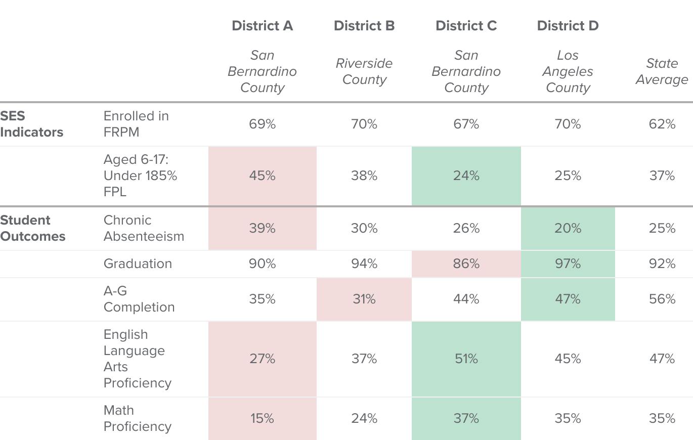
Just as FRPM eligibility rates can mask substantial differences in the underlying economic conditions students face, they can also miss large gaps in student outcomes. Table 2 uses the set of four districts with similar FRPM shares from Table 1 above. These districts provide an example for how disparate outcomes can be in districts the state formula funds nearly identically.
Despite similar FRPM rates, outcomes vary substantially and correlate with Census poverty differences (same example districts as in Table 1)
SOURCES: California Department of Education; American Community Survey; Authors’ calculations.
NOTES: Same districts as displayed in Table 1. Color key for student outcomes: Red represents the least ideal value (highest or lowest value dependent on context), and green represents the most ideal value (lowest or highest value dependent on context). A–G completion rate is the share of high school graduates who met UC/CSU requirements. ELA and Math proficiency rates are the share of students who met or exceeded proficiency California’s 2022 Smarter Balanced Assessments.
With the highest share of students in or near poverty as measured by 185 percent FPL, District A has greater socioeconomic disadvantage than the others. Unsurprisingly, its test score and other academic outcomes are much lower. A–G completion (courses required for admission to the University of California or California State University) is only 35 percent, and grade-level proficiency in English Language Arts (ELA) and math are 27 and 15 percent, respectively. By contrast, District D, which has nearly half the rate of school-aged child poverty and household incomes 70 percent higher (as shown in Table 1), has much better academic outcomes. Their A–G completion is at 47 percent, 45 percent are proficient in ELA, and 35 percent are proficient in math. Districts B and C follow a similar pattern, with lower levels of poverty and better outcomes than District A. Importantly, not all outcomes are best in District D and lowest in District A; this underscores how any measure of socioeconomic conditions is only partially correlated with outcomes. Nonetheless, the fact that each district has similar FRPM and similar funding and yet vastly different socioeconomic conditions and academic outcomes highlights how FRPM is limited in its ability to target socioeconomic need.
Across Multiple Outcomes, FRPM Has Less Predictive Power than Other Income, Poverty, and SES Measures
We examine this more precisely by looking at the strength of the relationship between student outcomes and FRPM rates, as well as other measures of student need. We focus on data from 2022 to provide context on what best predicts and explains student need currently.
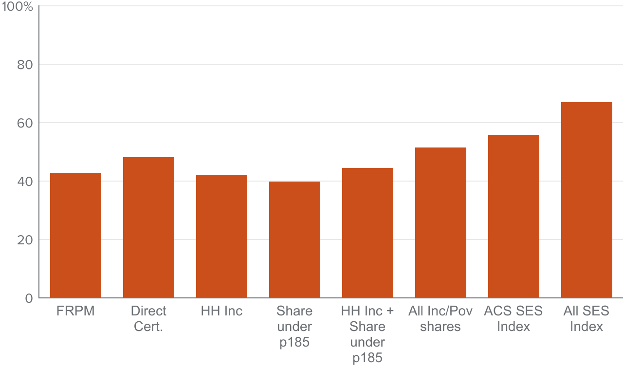
We begin with test scores. The district FRPM share is strongly related to test scores, explaining roughly 43 percent of the variation across districts with only this single indicator (Figure 7). This is consistent with past research documenting that while FRPM may be an imperfect measure of poverty and household income, it does capture elements of socioeconomic disadvantage not reflected in household income data (Domina et al. 2018). Notably, using the share of households with school-aged children under 185 percent of the poverty line—the baseline criteria for FRPM eligibility—the predictive power is similar but slightly lower, at 40 percent. Household income is roughly similar, but interestingly, the share directly certified for FRPM (which does not include those certified through income eligibility forms), does somewhat better, explaining 47 percent.
FRPM explains sizable share of test score differences—but some other measures and composites have more predictive power
Share of variation in test score explained (%)
SOURCES: California Department of Education, American Community Survey; Authors’ calculations.
NOTES: Share of variation (adjusted R-squared) from regression of the district average ELA and math test scores on each measure reported by each bar. Columns (from left to right): FRPM only (“FRPM”); direct certified share only (“Direct Cert.”); household income only (“HH Inc”); share <185% poverty only (“Share under p185”); household income and share <185% poverty (“HH Inc + Share under p185”); household income and share in all ACS poverty bins (“All Inc/Pov shares”); same, with additional SES variables from ACS (“ACS SES Index”); same, with non-FRPM SES variables from CDE district data (“All SES Index”).
When we combine measures, however, we can account for more of the differences in test scores across districts. Including both income and poverty is slightly better than including only one; including separate indicators for the shares of households at different levels of poverty (e.g., deep poverty, near poverty, slightly above poverty, far above poverty) does much better. Finally, we include additional variables available in both the Census and in the CDE school data that reflect socioeconomic disadvantage, such as lower level of parental educational attainment or less-stable family structures. These allow us to explain over two-thirds of the differences in district average test scores.
By integrating multiple indicators we may be able to achieve a more precise and equitable allocation of educational resources, tailored to the nuanced needs of diverse student populations. This approach not only supports more targeted interventions but also promotes a deeper understanding of the complex interplay between poverty and educational achievement. We also examine the predictive power of the “Strong Start Index,” based on birth outcomes in a local area (we use index data at a five-year lag—e.g., 2017 index data for the 2022–23 school year data). We find that the index is strongly correlated across outcomes, comparing favorably to FRPM, though slightly worse than other indicators analyzed in this section.
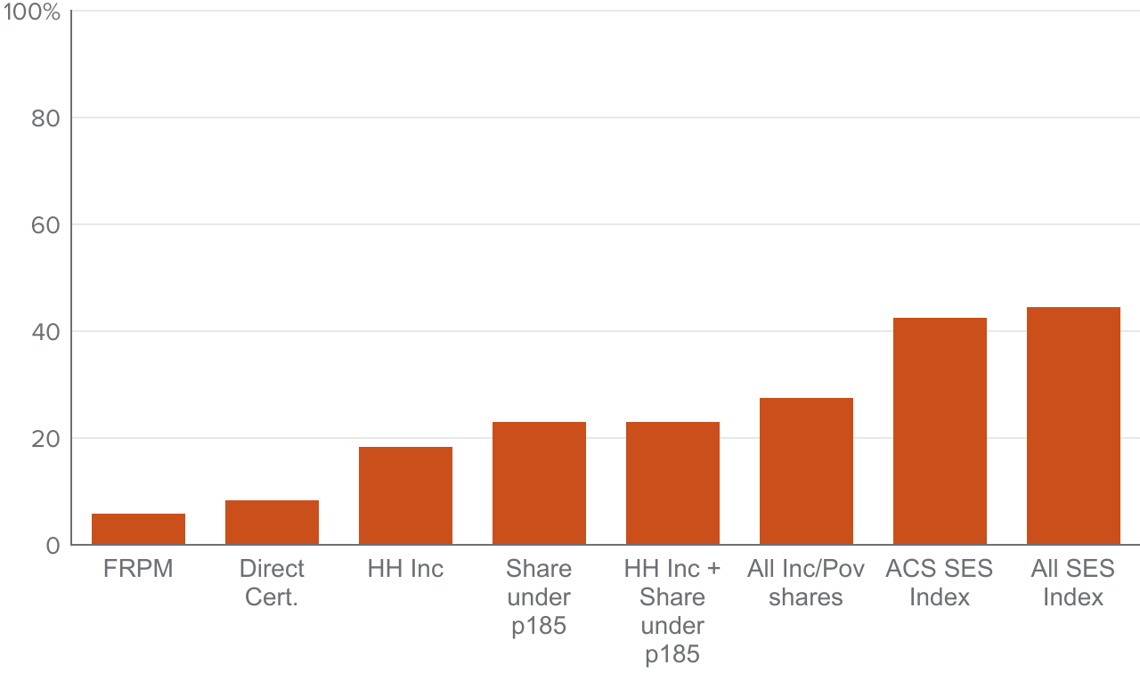
The predictive power of the FRPM indicator notably diminishes for high school outcomes. FRPM explains only 6 percent of the variation in graduation rates (Figure 8). For A–G completion, FRPM explains more (25%) but still much less than for test scores (Figure 9). The share directly certified does slightly better on both outcomes, but not by much. Unlike for test scores, household income and poverty explain a much greater proportion of the variation. Finally, composite indices that include income, poverty, and other indicators of socioeconomic disadvantage do considerably better. This could indicate that high school graduation and A–G completion are influenced by a broader array of factors—potentially including academic preparedness, school engagement, and support networks—not fully captured by FRPM or other poverty indicators alone.
FRPM explains little of the variation in graduation rates
Share of variation in graduation rates explained (%)
SOURCES: California Department of Education; American Community Survey; Authors’ calculations.
NOTES: Share of variation (adjusted R-squared) from regression of district graduation rates on each measure reported by each bar. Columns (from left to right): FRPM only (“FRPM”); direct certified share only (“Direct Cert.”); household income only (“HH Inc”); share <185% poverty only (“Share under p185”); household income and share <185% poverty (“HH Inc + Share under p185”); household income and share in all ACS poverty bins (“All Inc/Pov shares”); same, with additional SES variables from ACS (“ACS SES Index”); same, with non-FRPM SES variables from CDE district data (“All SES Index”).
FRPM has lower predictive power for A–G completion than other indicators
Share of variation in A–G completion rates explained (%)

SOURCES: California Department of Education; American Community Survey; Authors’ calculations.
NOTES: Share of variation (adjusted R-squared) from regression of district A–G completion rates rates on each measure reported by each bar. Columns (from left to right): FRPM only (“FRPM”); direct certified share only (“Direct Cert.”); household income only (“HH Inc”); share <185% poverty only (“Share under p185”); household income and share <185% poverty (“HH Inc + Share under p185”); household income and share in all ACS poverty bins (“All Inc/Pov shares”); same, with additional SES variables from ACS (“ACS SES Index”); same, with non-FRPM SES variables from CDE district data (“All SES Index”).
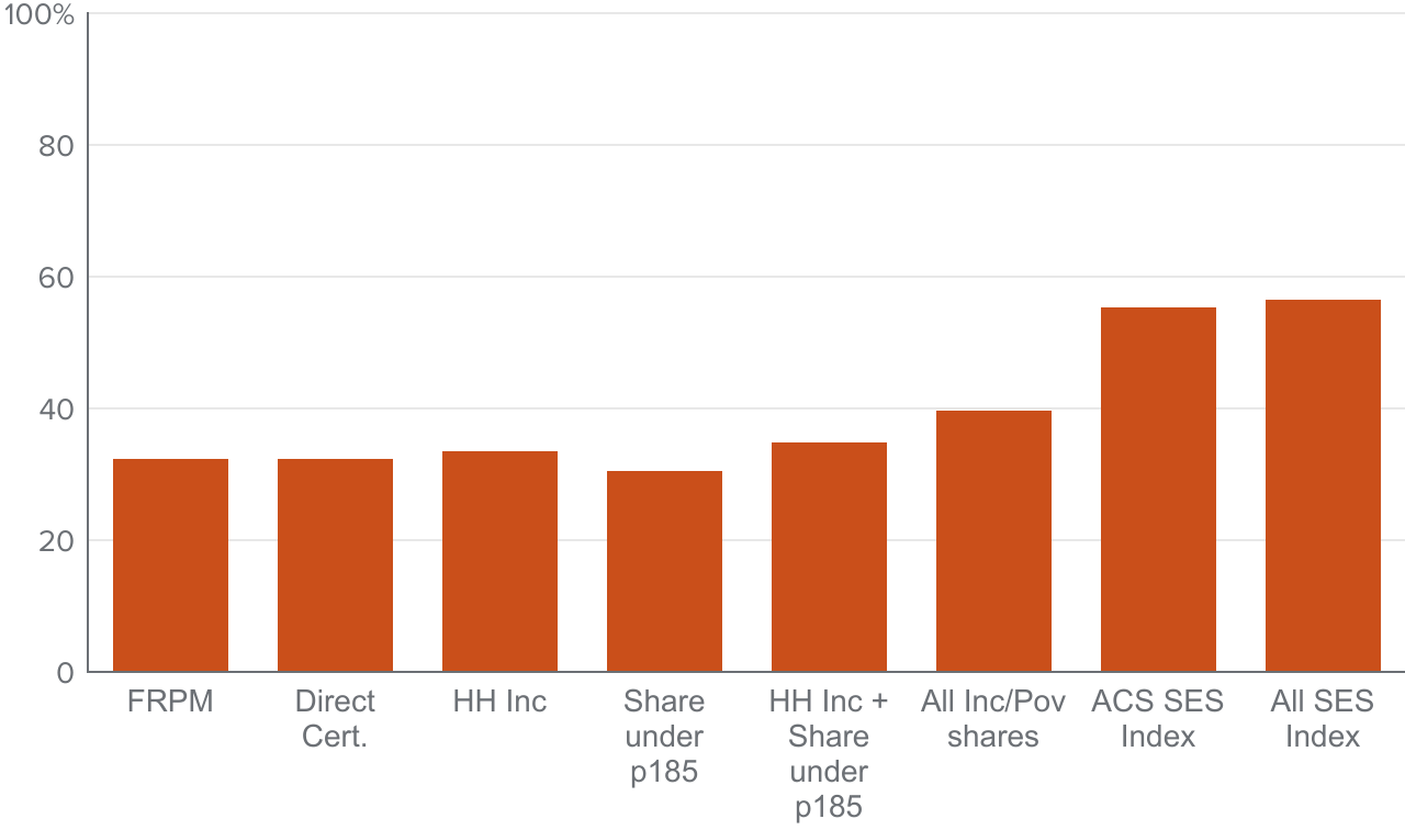
Finally, we consider chronic absenteeism (Figure 10). There are similar levels of explanatory power among the different poverty and income measures (explaining 31%–33% of the variation). Including both income and poverty does only slightly better (35%, and up to 37% with more fine-grained poverty in column 6). Once again, the inclusion of broader socioeconomic measures substantially increases the predictive power. Notably, FRPM is similar in its predictive power to other SES measures. FRPM has a slightly stronger correlation with chronic absenteeism than most other measures except for family median income, but the differences are small.
Composite SES indices explain much larger share of variation in absenteeism than other measures
SOURCE: California Department of Education. American Community Survey; Authors’ calculations.
NOTES: Share of variation (adjusted R-squared) from regression of district chronic absenteeism rates on each measure reported by each bar. Columns (from left to right): FRPM only (“FRPM”); direct certified share only (“Direct Cert.”); household income only (“HH Inc”); share <185% poverty only (“Share under p185”); household income and share <185% poverty (“HH Inc + Share under p185”); household income and share in all ACS poverty bins (“All Inc/Pov shares”); same, with additional SES variables from ACS (“ACS SES Index”); same, with non-FRPM SES variables from CDE district data (“All SES Index”).
These findings underscore FRPM’s limited effectiveness predicting student outcomes and highlight the potential advantages of incorporating additional indicators like family median income, more detailed measures of poverty, and education levels into metrics of student need. Furthermore, the fact that FRPM explains little of the variation in non-test score outcomes also suggests that the funding formula’s emphasis on FRPM—and more generally, only measures based on household income or poverty—may miss important factors and outcomes.
Decoupling student income and other demographics —like EL status—can improve targeting
So far, we have only examined the predictive power of singular indicators defining high-need students. However, many state funding formulas account for student need across multiple categories, often with different weights for different student groups. That is to say, these formulas rely on “duplicated” counts of student need, and distinctly consider multiple categories. Conversely, California’s “unduplicated” formula does not distinguish between a single or multiple high-need categories.
Figure 10 presents results for test scores, comparing FRPM to the unduplicated high-need share, EL shares, and then to duplicated counts that separately consider income, EL status, foster youth, and homelessness. Notably, duplicated counts using FRPM or direct certification do better than using FRPM or direct certification alone—and have more predictive power than using the unduplicated high-need student counts as in the current formula. The differences are modest, though duplicated counts explain about 5–10 percent more variation in test scores than the current unduplicated count. The pattern is largely similar for A–G completion rates, graduation rates, and absenteeism rates: duplicated counts perform slightly better than unduplicated ones, with more substantial gains when compared to using FRPM or EL shares alone (Technical Appendix Figures E8–E10).
Duplicated counts predict outcomes slightly better than FRPM or current unduplicated high-need counts
Share of variation in test scores explained
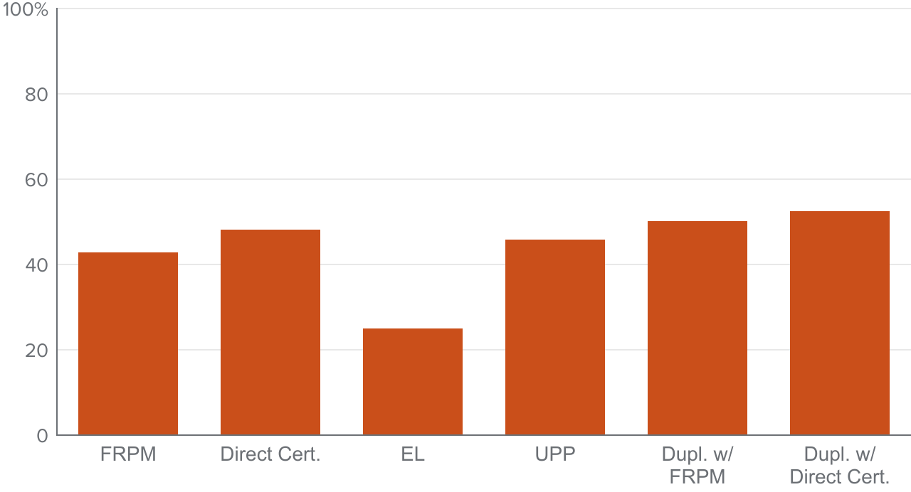
NOTES: Share of variation (adjusted R-squared) from regression of the district average ELA and math test scores on each measure reported by each bar. Columns (from left to right): FRPM only (“FRPM”); direct certified share only (“Direct Cert.”); EL share only (“EL”); high-need share only (“UPP”); duplicated counts using FRPM for low-income (“Dupl. w/ FRPM”); duplicated counts using direct certification for low-income (“Dupl. w/ Direct Cert.”).
Simulating Alternative Funding Mechanisms
Fundamentally, using indicators with a stronger relationship and predictive power for academic outcomes improves the ability for any funding formula to target disparities in achievement across districts and by student demographics. However, any change comes with potentially significant implications for district funding—districts that receive higher levels of funding under one indicator may not do better under alternatives. Policymakers considering alternatives also need to understand the implications for different types of student groups, and the magnitude of potential changes.
In this section we provide a high-level overview of potential changes to the LCFF formula using selected alternative weighting schemes and/or poverty metrics. Importantly, we do not view these as predictions of any actual formula or alternative, as we do not consider all elements of LCFF funding across all districts. Rather, we focus only on supplemental and concentration funding (i.e., not base funding), and consider only the current formula’s funding mechanism and any alternatives through the measure and/or weighting scheme for student need. We do so to highlight the general potential impacts and tradeoffs faced when using alternative indicators, given the distribution of student socioeconomic needs across the state.
To simulate alternatives, we allocate all supplemental and concentration dollars in 2022–2023 (so that it is zero-sum) across our sample based on different formulas. We begin with the current formula, and then compare to alternative allocations with the same total funding amount. We consider six main funding distributions: the current system and five alternatives. The first four alternatives are duplicated counts that separately consider low-income, EL, foster, and homeless students. We also consider versions with and without a concentration grant, analogously structured to the current formula (20% weight, then 65% weight after a given threshold for need). Our final alternative measure implements a broad SES index, constructed using the one reported in the prior section, and then adding a concentration weight to the formula.
- Baseline formula. Supplemental grant (20% weight) and concentration grant for (unduplicated) high-need students above 55 percent within district (65% weight).
- Duplicated counts. Use the sum of the district shares FRPM, foster youth, EL, and homeless (i.e., equally weighted across all categories) to allocate supplemental funding.
- Direct certification instead of FRPM, and duplicated counts. Same as 2, but replace share FRPM with the share directly certified.
- Duplicated counts, with concentration grant. Same as 2, but include a concentration grant with the same weight as the LCFF formula, and with the same share eligible for concentration funding as the LCFF formula.
- Direct certification and duplicated counts, with concentration grant. Same as 3, but include a concentration grant with the same weight as the LCFF formula, and with the same share eligible for concentration funding as the LCFF formula.
- Broad SES index, with concentration grant. Test-score weighted index including Census income and poverty measures, and Census and CDE SES and demographic measures. The index is then weighted to have a concentration grant with same weight as the LCFF formula, and with the same share eligible for concentration funding as the LCFF formula.
Table 3 illustrates the per-student allocation of targeted (i.e., non-base) funding by student demographics under each alternative scenario. Column 1 reports the average additional funding per student group under the current formula for our sample; Columns 2–6 report the difference in funding for each group under alternative weightings. Here, for each student demographic type, we assign them the funding level at their district.
A few patterns emerge. First, duplicated counts without a concentration grant would tend to allocate less funding to students in or near poverty—and students who are not at grade level in math or ELA. More surprisingly, these formulas would also allocate less per EL and foster youth students on average, even though they are duplicated (though not by much for EL: only a $72 difference per EL student for a duplicated versus current unduplicated funding formula). Conversely, homeless students would stand to gain substantially, by roughly $80 to $160 per student across the two alternatives. Why is this the case for EL and foster youth, if duplicated counts would seemingly mean adding weight to these students? Under the current formula, EL and foster students tend to be concentrated in districts with high levels of need, and the additional weight of a concentration grant would outweigh the added impact of a duplicated formula without a concentration grant.
Additional (non-base) funding allocated to each student group

SOURCES: California Department of Education; American Community Survey; U.S. Census Bureau; Authors’ calculations.
NOTES: Dollars per student based on 2022–23 enrollment. Only considers LCFF supplemental concentration and not base dollars. See Technical Appendix E for full details on sample and estimation.
With formulas that are duplicated and have a concentration component, duplicated counts and those using direct certification instead of FRPM redirect additional funding across nearly all student categories of income, need (e.g., EL or foster), and test score performance. For example, a duplicated formula with a concentration grant would provide an additional $223 per EL student, and an additional $314 per EL student if the formula used directly certified shares instead of total FRPM counts. For poverty, near-poverty, and test scores the difference is smaller but still positive (higher funding under the alternative).
Perhaps somewhat surprisingly, the broad SES index directs less funding to low-income and EL students than the actual formula, even with a concentration grant component. The differences are small, but the index allocates less for students in poverty or near poverty, with a larger difference for EL students (by about $100 less). For test scores, the difference is negligible, even though test scores are used to define the weights for the various components in the index, and the index has a higher predictive power for test scores than the LCFF formula does.
As shown earlier, examining the distribution of funding by considering only one metric can still be misleading. Per-student funding under the current formula may not look very different from alternatives with a concentration grant on average, but alternative weightings or indices that do not rely on FRPM may have less potential for misallocation to places with higher or lower levels of disadvantage at the same FRPM level. Recall, as shown in Tables 1 and 2, districts with similar FRPM can have very different rates of other socioeconomic conditions and outcomes. Thus, for example, even though the broad SES index shows only small differences on average versus the current formula, its higher predictive power across student outcomes—as detailed in the prior section—suggest that it would more accurately target student needs.
Finally, the evidence in Table 3 and Figures 7 through 11 in the prior section suggest that using direct certification instead of FRPM along with duplicated counts may improve funding equity while simultaneously targeting low-performing districts more directly. For every outcome measure we considered, EL and students in poverty are better targeted, and the direct certification share is more highly correlated with test score differences across districts.
Districts that gain under alternative formulas tend to have higher EL shares
We also examine the share of districts that lose or gain funding—and that gain or lose a significant (greater than $500 per student) amount. To preface: we have no objective criteria from which to interpret whether these changes are good or bad with respect to student equity. Rather, it is important to understand how much funding would change under alternatives and how many districts would see substantial change given that any formula shift would have real impacts on current district operations—if changes are zero-sum and revenue neutral.
More districts would gain than would lose funding under duplicated counts without a concentration grant, using either FRPM or direct certification (Technical Appendix Table F2). However, the gains would be smaller than the losses—on average the share who lose more than $500 would be greater than the share who gain more. For duplicated counts with a concentration grant, the opposite is true: many more districts lose funding than gain it. But the average amount lost would tend to be quite small: for a duplicated formula with a concentration grant, only 8 percent of districts would lose more than $500 per student (out of 70% that lose any funding). For the broad SES index, the share gaining and losing is close to an even split: 53 percent gaining to 47 percent losing, with a higher share of districts gaining substantially than losing.
We also examine the characteristics of the funding “winners” and “losers” under the five alternatives (Technical Appendix Table F3). Consistent with Table 3, the results show that without a concentration grant component, alternative funding schemes would tend to redistribute targeted funding from lower- to higher-income districts and students on average, and from places with lower to higher test scores. This is also true for the broad SES index. Conversely, alternative formulas using that rely on duplicated counts and a concentration grant component would lead to higher funding in lower-scoring, higher-poverty, and lower-income districts. Districts that would gain funding under these mechanisms also have nearly double the share of EL students.
Cost to hold all districts harmless and fully implement new formula could require doubling current supplemental and concentration spending
Up to this point, our consideration of alternative funding formulas has assumed revenue neutrality, meaning that some districts will lose and some will gain funding. While researchers, policymakers, and advocates can debate the merits of different methodologies, implementing a new funding formula that generates large swings in revenues across different districts would at best be impractical, and at worst politically divisive, challenging to implement, and disruptive to district operations and student programs. For this reason, we provide context on how much additional funding would be required under each alternative to ensure that all or nearly all districts are “held harmless” and see no loss in funding. Notably, the implementation of LCFF was phased in and accompanied by a large revenue increase to ensure that formula changes did not result in direct losses for any districts. Across states, such hold harmless policies are common when implementing new formulas (Roza and Jarmolowski 2020).
Table 4 reports these results. Here, we consider hold harmless provisions under the full implementation of a formula, where all districts receive more so that the distribution remains the same. This is different from a hold harmless where districts that would lose funding would be guaranteed their prior funding amount instead of the formula-specified amount. The first column shows the total amount of supplemental concentration funding our simulations consider, based on our sample of roughly 75 percent of districts—$11.6 billion. For non-concentration formulas, the hold-harmless cost would be roughly $10–11 billion, nearly doubling current non-base funding.
However, were we to only require that 95 percent of all districts are held harmless, that would fall to around 40 percent (less than $5 billion). Further weakening the restriction to holding 90 percent of districts to the same or higher funding would require less than a 30 percent increase in funding ($3 billion). For concentration formulas the total amount of the hold harmless is larger, though magnitudes are similar for less-restrictive policies that only hold 95 or 90 percent harmless. Finally, the broad SES index would be the costliest, in part because it is the largest deviation from current funding policy: creating more variation relative to current funding, which would in turn require greater additional funding to hold all or nearly all districts harmless (141% of current supplemental and concentration funding).
Holding all districts harmless is costly, but only holding 95 percent harmless would reduce the additional cost by half or more
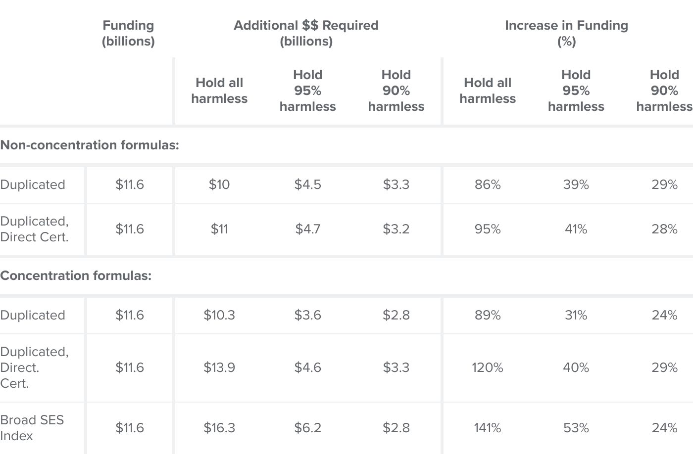
SOURCES: California Department of Education; American Community Survey; Authors’ calculations.
NOTES: Funding amounts in billions. Columns 2–4 show increase required to hold given share of districts to same funding level under alternative formulas. Columns 5–7 show increase required in percentage terms, relative to the $11.6 billion in supplemental and concentration funding in our main estimation sample. See Technical Appendix F for additional details.
Conclusions and Recommendations
California’s TK–12 system has long used free and reduced-price meal (FRPM) enrollment as a proxy for income to allocate additional funding and assess gaps in achievement. But recent changes in policy—such as universal school meals—make it increasingly important to find alternative measures. Furthermore, focusing only on whether students meet a given income threshold misses important differences throughout the income distribution—for instance lacking the nuance to distinguish deep poverty from near-poverty.
We find that FRPM has not matched recent trends in poverty and income as measured in other survey data. As of 2023 the share of FRPM students is now close to that under 400 percent of the poverty line—far above the baseline 185 percent of the poverty line the program’s income eligibility requires. Reasons for this divergence are myriad, likely reflecting differing eligibility criteria, variability in incomes, and nuances in income measurement. We find some evidence that since LCFF, financial incentives to identify FRPM students may have played a small to modest role—though evidence is strongest and most consistent in its early years, and less clear post-pandemic.
Beyond the recent increase, however, we also find evidence that FRPM shares across districts mask considerable differences in underlying socioeconomic conditions and educational outcomes. Districts with the same FRPM share—and in turn, funding under LCFF—can have vastly different levels of income, poverty, and housing wealth. As a measure to predict outcomes, FRPM performs decently, but it is a worse indicator than other Census-based measures—such as income and/or poverty—and already-collected education system measures—such as the share directly certified. Moreover, while FRPM can effectively proxy for student test score outcomes, it explains little variation in graduation, A–G completion, and absenteeism.
Based on our findings, we offer the four main policy recommendations and considerations below.
Consider new alternatives to FRPM for measuring low-income status. FRPM generally has worse predictive power for student outcomes than alternative income measures or indices. The fact that we now have universal meals means we have less of a reason to expect FRPM to be an accurate representation of student need and the most equitable way to distribute funding. Beyond its predictive power, there are also signs of potential misallocation under FRPM, in which higher-SES districts can achieve the same or greater funding than districts where the data show worse socioeconomic and academic outcomes across other measures. Examinations of FRPM data linked to tax records in other states suggest that the error can be two-sided: missing potentially eligible low-income students and counting students whose family tax records indicate income over current thresholds. Our findings are consistent with this research and reflect growing consensus among national researchers on the need to consider alternatives.
Explore data connections to automatically identify low-income students based on income and/or safety net records. Currently, direct certification better explains gaps in outcomes across districts and could steer more funding toward lower-income districts and districts with lower test scores. Many other states rely on direct certification to identify low-income students for funding purposes. But there are technical limitations, as not all students can or will access safety net programs required for direct certification—indeed, data from the California Department of Social Services shows that “program reach” varies substantially across counties. Beyond direct certification, policymakers should also explore data linkages between education records and state income and employment records. While imperfect, these could allow for more automatic, precise, and consistent measures that improve both equity and efficiency. They could also allow for more nuanced treatment of income and poverty, distinguishing deep poverty from poverty, middle from high income, and varying community income levels. However, special consideration will be needed to ensure accurate representation of students in households with undocumented parent(s) and/or non-traditional earnings records that may not be reflected in state administrative income data.
Consider using duplicated counts for EL, foster youth, and homeless students. Most other states that use a weighted formula allow for separate funding weights for different populations. While such changes would undoubtedly complicate California’s formula, flexibility in district spending could be maintained to avoid a return to the heavy reliance on categorical funding prominent prior to LCFF. Our findings suggest that duplicated counts would better reflect the educational needs facings students—and thus could improve the district funding and programmatic capabilities to effectively serve diverse student populations—such as English Learners, homeless students, and foster youth.
Explore methods to incorporate broader community characteristics and income levels. Beyond the economic circumstances facing students and their families, research consistently shows that community conditions also play an important role in educational opportunity and outcomes. To the extent that these factors mediate socioeconomic disadvantage facing students, targeting funding based on these underlying characteristics could better address gaps in test scores and other student outcomes. Indeed, part of the original motivation for the concentration grant was to proxy for these differential community characteristics. Our analyses show that broader need indices that account for community conditions—like our estimates using Census data, or the Strong Start Index—have strong predictive power to explain student outcomes compared to FRPM, especially when considering non-test score outcomes like graduation and A–G completion. These factors could be incorporated directly into the high-need weight, into an alternative concentration grant component, or could be used as a third “grant” in the formula.
Alternative formula schemes may better proxy for student outcomes but would create winners and losers. Fully implementing a new formula that holds all districts harmless could require doubling current supplemental and concentration funding under certain alternatives. Any changes would therefore require difficult choices, and/or anticipated sources of new revenue growth. Nonetheless, our simulations suggest alternative measures could better target student need—correcting some of the uneven allocation induced by vast differences in FRPM take-up across districts—while simultaneously directing more funding to students in the highest need categories: EL students, homeless students, those with low test scores, in poverty, and those in low-income communities.
We caution that our hypotheticals are not meant to be rigorous predictions. Rather, we hope to provoke further research and policy discussion around potential modifications to California’s school finance formula. With growing post-pandemic learning and socio-emotional needs and LCFF in its second decade, future research should take careful consideration of any alternatives to better enable California to deliver funding effectively, equitably, and adequately across the state’s nearly 6 million TK–12 students.
Topics
K–12 Education